Nonprofit organization · Client engagement
Mimi's Mission
Designing one digital home for an entire community ecosystem.
A Southeast Michigan nonprofit supporting autistic individuals and their families, with several programs, many audiences, and one website that had to serve all of them.
- Organization
- Mimi's Mission
- Industry
- Nonprofit, autism support and community programs
- My role
- Digital strategy, design, development, and content systems
- Status
- Live
A working demonstration
Six audiences arrive at the same front door. Pick one and see its path.
Go on, move something.
Try it
Six audiences, one front door
Pick who you are. The path that appears is the one the site was built to give you. The architecture problem was that all six of these arrive at the same homepage and need a different second click.
- Events and outings, filtered to what is coming up
- What to expect: setting, sensory notes, who it suits
- Register the family
- Consent and waiver, handled in the same flow
- Confirmation, plus the next event
Notice where consent and waivers sit. Inside the registration flow, not after it. That is the step where a willing family usually gives up.
Situation
Before anything was designed.Where this started
Mimi's Mission supports autistic individuals and their families across Southeast Michigan. It runs several programs at once: an Autism Acceptance Group, Young Adults programming, family events and outings, workshops, and 911READY, a program built around first responders.
Each of those programs has its own audience, its own calendar, and its own way in. A parent looking for a family event, a young adult looking for programming built for them, a donor, a volunteer, a sponsor, and a first responder are all valid visitors, and they need different things within a few seconds of arriving.
Before the rebuild, that variety was the problem. Everything was present, but the paths crossed. A visitor had to understand the organization's internal structure before they could find their own next step.
The core challenge
The problem to solve
Serve six audiences and several programs from one website without making anyone read past their own reason for visiting.
Who it had to work for
The people on the other side of it
- Families
- Programs and events their family can actually attend, with clear expectations.
- Autistic young adults
- Programming addressed to them directly, not to their parents.
- Donors
- A clear, dignified path to give and an understanding of what it supports.
- Volunteers
- A straightforward way to offer time and hear back.
- Sponsors
- Visible recognition and a sense of who else supports the work.
- First responders
- The 911READY program, its purpose, and how to participate.
My responsibilities
First person, on purpose.What I was responsible for
Stated by specific verb, so it is clear what I did rather than what the project did.
- LedWebsite strategy and the approach to serving multiple audiences from one site.
- DesignedInformation architecture and program organization.
- BuiltThe website, its event presentation, and its content structure.
- DesignedRegistration, donation, volunteer intake, and newsletter journeys.
- BuiltConsent and waiver workflows attached to event registration.
- DesignedSponsor presentation and recognition.
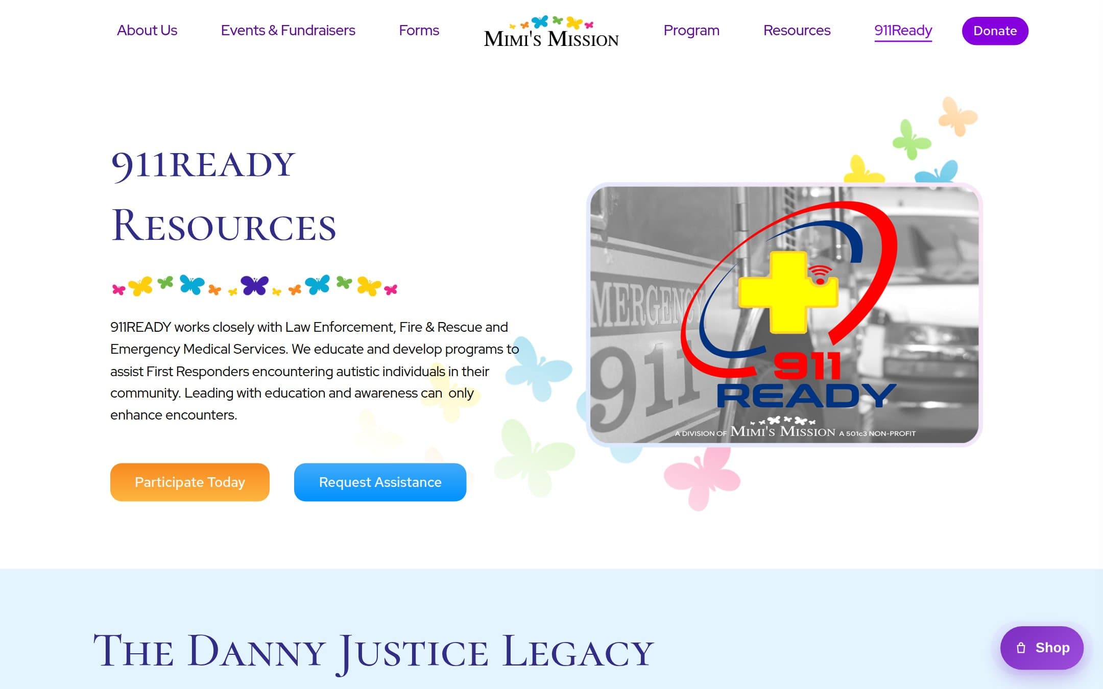
- DesignedThe 911READY program experience and first-responder pathways.
- SupportedEvent promotion with supporting graphics and digital materials.
Strategic approach
How I approached it
Route by reason for visiting, not by org chart
The navigation was organized around why someone came, not around how the organization is structured internally. A donor and a volunteer should never have to learn the difference between a program and an initiative to find their own path.
Write with dignity, not sympathy
Copy addresses autistic individuals as participants and community members, never as a problem being solved. Young Adults programming speaks to the young adults it serves. This was a content decision before it was a design decision.
Accessibility as the baseline, not the audit
For an organization serving this community, an inaccessible website is a contradiction. Semantic structure, keyboard operability, contrast, clear focus states, and readable forms were part of the build rather than a final pass.
Registration is where good intentions get lost
Event registration, waivers, and consent are where a willing family gives up. Those flows got the same attention as the homepage: short, clear, one thing at a time, and honest about what happens next.
The journey
The path it had to support
- ArriveFrom search, a shared event post, or a community referral.
- Recognize yourselfFind the path that matches the reason for the visit within seconds.
- Understand the programWhat it is, who it is for, when it happens, and what to expect.
- ActRegister, donate, volunteer, sponsor, or join the 911READY program.
- Complete requirementsConsent and waiver steps handled inside the registration flow.
- Stay connectedNewsletter registration and event calendar for the next thing.
Diagram
Six audiences, six first steps
The architecture problem in one picture. Every audience shares a front door and needs a different second click.
- One front door
- Families
- Young adults
- Donors
- Volunteers
- Sponsors
- First responders
- A completed action
What was built
Designed, specified, and shipped
- Website strategy, design, and development
- Information architecture and program organization
- Autism Acceptance Group presentation
- Young Adults programming section
- Family events and outings
- Workshops
- Event presentation and registration
- Consent and waiver workflows
- Donation experience
- Volunteer and community intake
- Sponsor presentation and recognition
- 911READY first-responder program experience
- Newsletter registration
- Content organization and supporting digital materials
Selected work
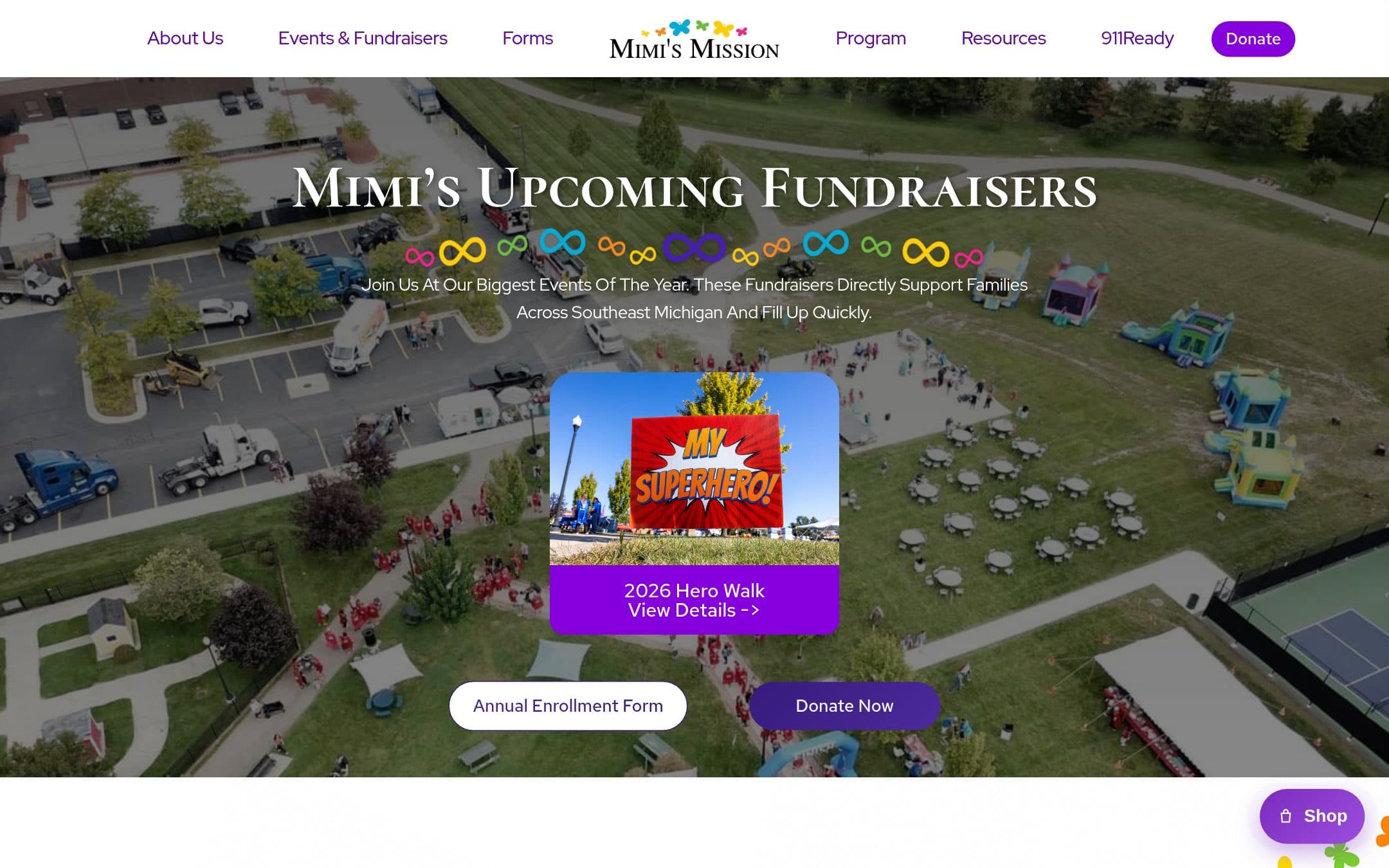
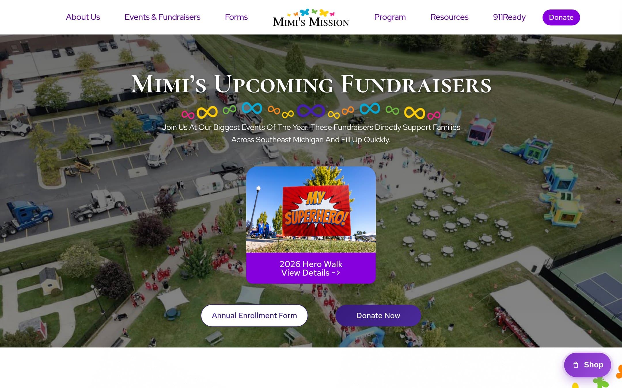
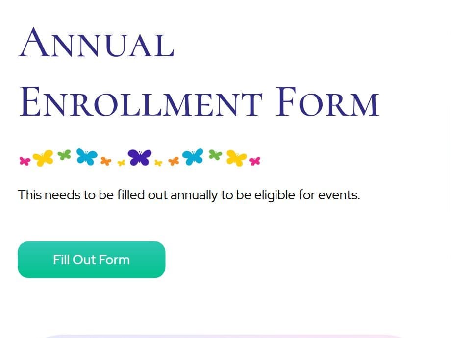
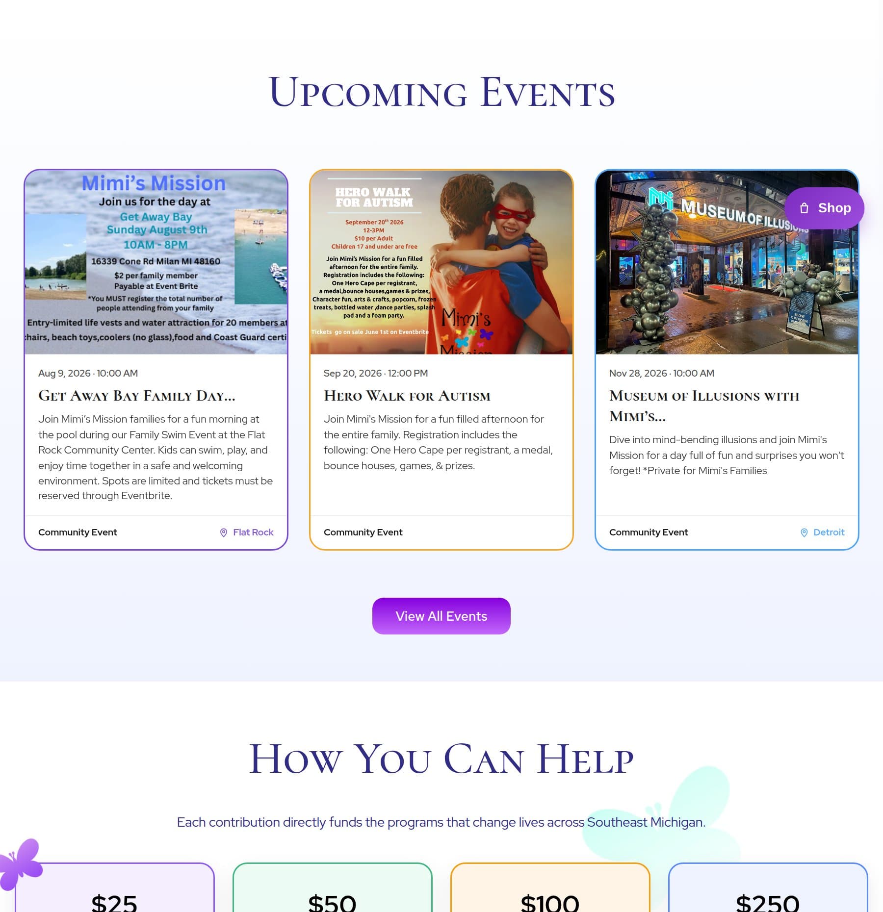
Captured from the live site.Selected visual work
Systems
Systems and integrations
- WordPress
- Website platform and content management
- Event registration and forms
- Registration, consent, waivers, and intake
- Donation processing
- Online giving
- Newsletter platform
- Ongoing community communication
Outcome and evidence
Numbers only where there is proof.What came of it
The organization has one website that gives each of its audiences a direct path, with registration, consent, donation, volunteer, and sponsor workflows handled in place rather than by email.
The clearest result is structural: a family, a donor, a volunteer, a sponsor, a young adult, and a first responder can each complete their own action without needing to understand the others.
Unified digital home
Consolidated several programs, events, and audiences into one site with a distinct path for each.
Self-serve registration and intake
Event registration, consent and waiver steps, volunteer intake, donations, and newsletter signup complete online. Ticketed events route to Eventbrite.
Accessible by design
Built with semantic structure, keyboard operability, and readable forms as a requirement rather than a later audit.
Held back on purpose
One further result is awaiting supporting evidence and is intentionally not published here. Numbers appear on this site only once they can be backed by a screenshot, a report, or written client confirmation.
How results are stated on this site
- Verified
- Backed by a screenshot, report, or written client confirmation. May be shown as a figure.
- Qualitative
- True and describable, but not measured. Shown as language, never as a number.
- Pending
- Claimed but unconfirmed. Never published until evidence exists.
Reflection
What I would tell you about it
This was the project where information architecture did the most visible work. There was no clever interaction to build. The value was entirely in deciding what belongs where and what a person should see first.
Writing for a community that is frequently written about badly required slowing down. Several passes were spent on tone alone, and the Young Adults section in particular needed to address the young adults themselves.
The consent and waiver flows are the part I would point to if someone asked what operational thinking looks like on a nonprofit site. They are unglamorous, they are where events actually get stuck, and getting them right is worth more than another hero animation.
Related work
Different industry, same shape
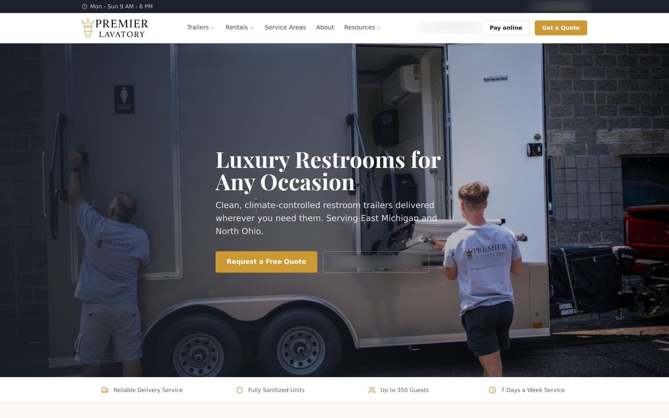
Event and rental services company
Premier Lavatory
Climate-controlled restroom trailers for weddings and corporate events, in a category that everyone assumes is the opposite of premium.
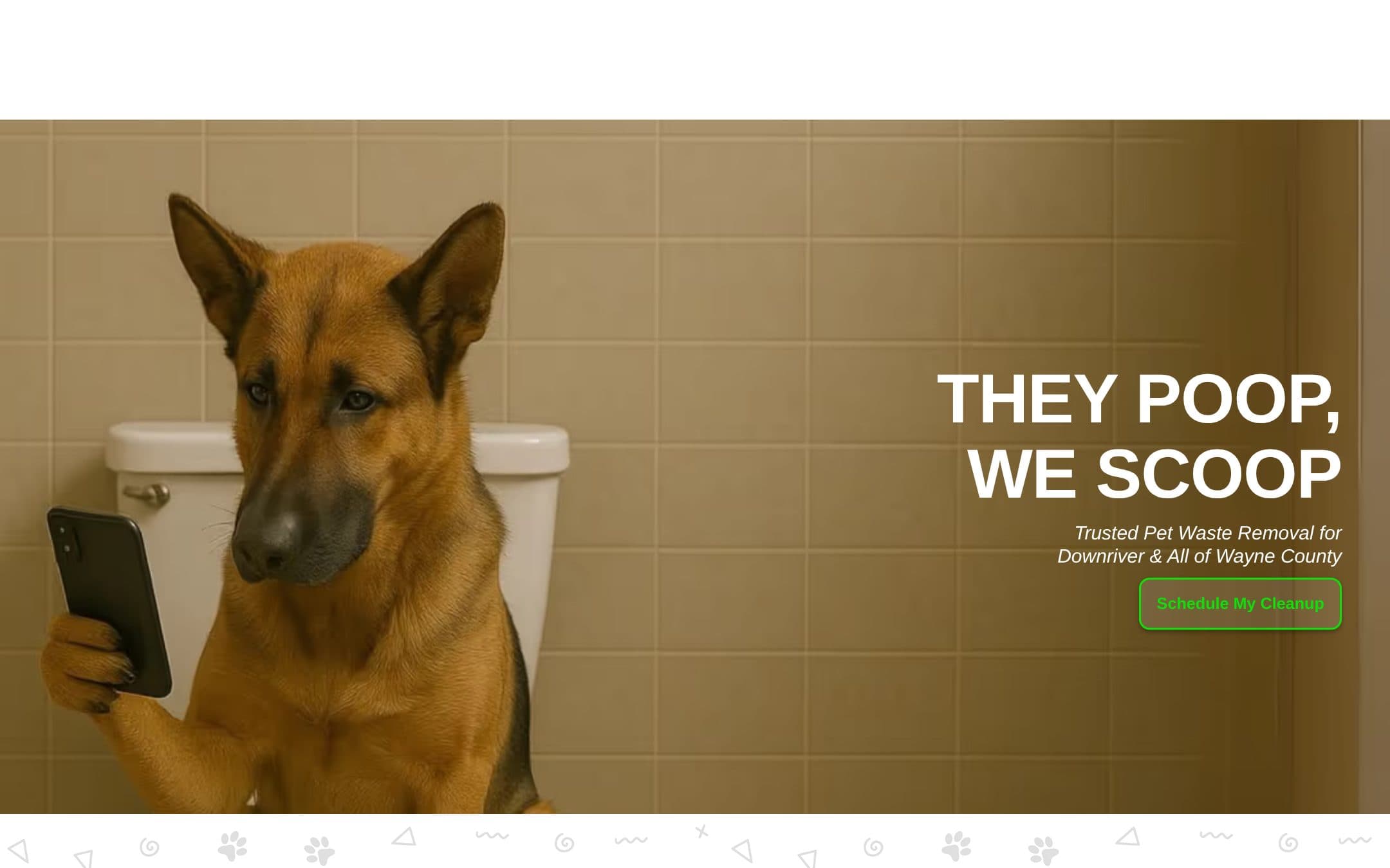
Local field-service business
Detroit Doo Disposal
A Downriver field-service business that needed to explain itself, earn local trust, and take bookings while the owner was in someone's back yard.
Working on something like Mimi's Mission?
If your situation rhymes with this one, the conversation is usually short and useful. Tell me where it is stuck.
Open to select opportunities
Working with me
Full-time roles, contract work, project collaboration, speaking, and introductions. This one comes straight to me.
Hiring The North
Digital strategy, business systems, customer journeys, websites, automation, and operational infrastructure. Delivered through The North.